Health & Fitness
Color Me Beautiful - The Psychology of Color
Choosing your paint colors can be a daunting task. Here's advice to help you move from the wax on wax off stage, and start you on a path to "paint the fence." (I heart Karate KId!)


Desert Tan, Tranquility, Simply White - what do these words have in common? They all identify a paint color. Over the years I have had one consistent pressing question from my clients. How do I choose my paint colors? What if I miss? When you go into a paint store and begin looking at the cornucopia of options do you get dizzy or maybe you are like a kid in a candy store who cannot decide for the perfect candy. (I mean paint) I know the feeling!
Although I do this for my clients I understand and appreciate the anxiety associated with paint selection. I believe color plays an important role in our lives. I think color has the ability to influence our feelings and emotions. Dear friends it doesn’t have to be difficult. It’s not the end all if you choose the wrong paint because the fact of the matter is it’s just paint.
Yes you may have to add a little more time to repaint a wall if you choose the “wrong” shade. I actually don’t think there can’t be a real wrong shade. I think if you go with your gut, your instincts, you can’t go wrong! Maybe you are in the wax on wax off stage of your trusting your instincts training and you need a little help. If you don’t have a trusted “Mr. Miyagi” or a Trusha (that’s me) in your corner to help you through the process, look around your house and find a pillow, rug, or a painting.
Find out what's happening in Smyrna-Viningswith free, real-time updates from Patch.
Take for example. I have a brown floral pillow. The background is brownish in color but the flowers are various shades of yellows and pinks. The leaves are various shades of green. I really loved the greens. I love the softness of the greens and thought what a wonderful color for the walls. Green is fabulous because it represents growth, nature, money, fertility and safety. Green is a relaxing color that is easy on the eye and has a healing power to it. It is often used to represent anything having to do with health. I love the fact that the color green is powerful and I liked the feel of it. So I decided to go with my gut and go with one of the shades of green for my walls.
I went with my gut and I couldn’t be happier. And as a bonus, seven years later, I continually receive compliments on my wall color from friends and family.
Find out what's happening in Smyrna-Viningswith free, real-time updates from Patch.
There are so many great websites to reference the meaning of colors, but I think the most important part is you have to like it. Go with a color you gravitate towards. You don’t have to match everything in the home. Go neutral. You won’t go wrong! Do you love the color yellow but are afraid to paint with it fearing the worst? You can’t go wrong with Benjamin Moore’s Desert Tan. Go visit Tag at the - he knows his paints. I’ve been there many times on behalf of clients and myself with tons of questions. He had answers to them all! Here are some simple rules of color and designs I follow.
-Maintain a continuous flow from one room to another while creating a sense of separation and progression.The use of repetition to create movement occurs when elements with something in common are repeated regularly or irregularly, sometimes creating a visual rhythm. Examples: color and or patterns. Repetition doesn't always mean exact duplication either, but it does mean similarity or near-likeness. Actually, slight variations to a simple repetition will add interest. Pick a color and use variations of that color throughout your home. In my home, my guests will see hues of blues and greens.
-Be inspired! Create a visual board of your favorite magazine clippings from your home decor magazine. This also can add interest as a unique art display.
-Add some toile. It always makes me smile when I see toile!
Colors and meanings
Red is a very strong color. It’s a very passionate color and is a great color for accents that need to take notice over other colors. I selected Bold Brick HGTV Home by Sherwin Williams for one of my clients. Wendy loved it!
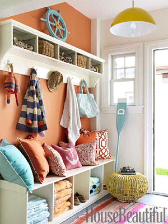
Orange is basically a blend of yellow and red. It is also a bright and warm color. It can stimulate appetite as well as a fun color for the kiddos. It has a high energy level so it is also associated to stimulate mental activity.
Blue is a cool calming color that shows creativity and intelligence. It is also associated with suppressing appetites. So maybe folks we should all have a blue fridge, right? Blue also represents loyalty, strength, wisdom, and trust. Because of its calming effects, it’s a great color for a master bedroom and bathroom. I love “tranquility” by Ben Moore! Its also popular with men, as seen in my husband’s wardrobe and man cave!
Yellow‘s qualities are very similar to Orange. Yellow is cheerful and energetic It represents youth, fun, happiness, and sunshine. For a subtle touch of yellow try Desert Tan by Ben Moore. It’s a great color for a foyer or a family room.
Thanks for reading. If you like to learn more about me or read some more blogs, visit my website at http://www.pondicherrydesigns.com. à bientôt – Trusha